How do you get a web site visitor to notice a particular piece of information on your web site, such as a new white paper or a limited time offer on a new device? Most of us assume, that if something is somehow emphasized on our web site it will get noticed. Well, maybe not. A new eye-tracking study is out from Dr. Soussan Djamasbi at the User Experience and Decision Making Research Lab at Worcester Polytechnic Institute, “Designing Noticeable Bricklets by Tracking Users’ Eye Movements.” The results bear a closer look.
Let’s start with “bricklet.” These are customizable chunks of web content, usually set off in a box or other such enclosure. They may contain an ad or a piece of content that you want to break apart, with the hope of emphasizing its contents for faster recognition.
But here’s the big question. What actually gets people’s attention faster?
According to Djamasbi and colleagues, “Visual hierarchy is a cognitive approach to user-centered design. In practice, web pages with a strong visual hierarchy will have contrasting perceptual elements of varying visual importance. Without the variation in emphasis, Tufte states, ‘nothing is emphasized; the design will be noisy, cluttered, and informationally flat.’ By creating a visual hierarchy, companies can naturally guide users in viewing their web pages in an effective and meaningful way.”
But what form should this emphasis take? This study tested size, graphics, color, and location with users ranging from age 23 to 60.
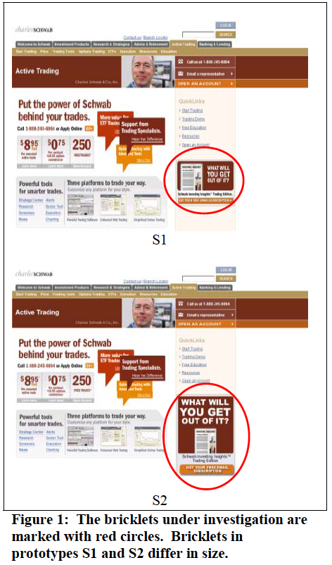
We assume a LARGER SIZE area will attract attention faster than a smaller size. The eye-tracking study showed that doesn’t seem to make much difference, even with a bricklet that’s twice as large.
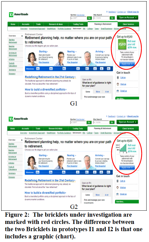
We assume a bricklet containing a GRAPHIC will attract attention faster than one without. The study showed a tiny increase in noticeability, but it’s not clear how significant that difference is. This study may have not differentiated the two ads clearly enough, as I consider the green box with $500 to be a graphical element as much as the actual graph. More research required here.
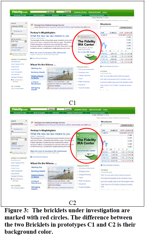
We assume CONTRASTING BACKGROUNDS will attract attention faster than areas without a contrasting background. This one is interesting because we have to take into account “banner blindness” before we got any further.
What is banner blindness? As banners have become more prevalent, mostly for advertising, site visitors have learned to ignore those parts of a site that look like colorful ads. We see this in the advertising work we do for clients. Graphic display banners are not a good lead generation device. They can be used to support your branding efforts, but there are better ways to generate leads online.
Back to contrasting backgrounds. The research showed that background color made a BIG difference in viewing time. The backgrounds WITHOUT contrasting colors were much more quickly noticed. If you stop and think about it, it’s not that surprising. Advertisers have always tried to find ways to make their messages look more like editorial content. Same principle applies here.
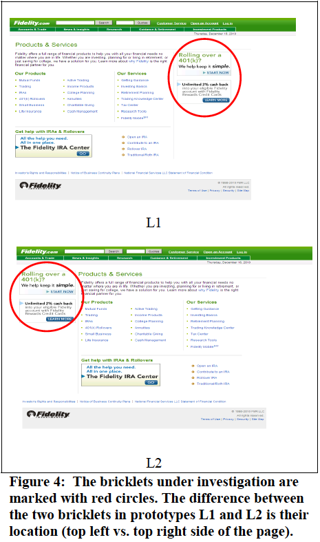
Lastly, the study looked at LOCATION. We assume content on left hand side of a page is noticed faster than on the right side in Western countries where we read left to right. Turns out, location doesn’t seem to make any difference.
Download the full research report from Dr. Soussan Djamasbi at Worcester Polytechnic Institute, “Designing Noticeable Bricklets by Tracking Users’ Eye Movements.”


